Mobile first or mobile only for your extensions

Mobile first is a design system that has become very popular lately. It is a system where the design of applications is prioritized for mobile devices, and once the design for mobile is available, we proceed to add functionalities for web (or desktop) format, where we have much more room.
Why is it important to use this design system (or even mobile only) when designing our extensions? In this article I'll explain it.
In the previous paragraph I mentioned the term mobile only. This is another design system similar to mobile first, but taken to the limit. Mobile only wouldn't extend functionalities for web, but rather focus and exclude the design for the mobile device version.
One of the reasons for choosing one of this options is because more than half of people have a mobile device, and it's estimated that 4 out of 5 of these devices are smartphones. These numbers are increasing, making the number of users that browse from a device of this type ever larger.
In addition, taking portability into account, a cellphone provides much greater comfort compared to any laptop, notebook, computer, etc. It's smaller and lighter, making it easier to take ir out of your pocket and complete a pending task.
Right, but... Why is all this even more important when developing Auravant extensions?
Why design over these systems?
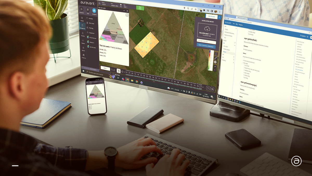
Let's imagine that we are developing a tool that seeks to create records in the field. This means, someone goes to a field, takes certain samples and records values for the desired variables. If we seek to save this information in the cloud, through the SDK, from the mobile application we can pull it off offline, thanks to the handler that the application has (put, patch, delete methods from Storage module).
What's more, it is much easier to take the cellphone out of your pocket than to carry a heavy computer and take it out every time you need to register a value... and I don't see it feasible for someone to carry a computer constantly in their hand either. Not to mention if the computer must be connected to a power source to work.

Mobile first or mobile only... Which one is better?
I'll go straight to the point.
For Auravant extensions, I would say that the optimal is mobile only, this should be the system we opt for in most cases.
This is not only due to everything mentioned above, but also to the format that the extensions have in web version. A web extension has a size comparable to a vertically placed cellphone, as it allows you to see the map next to the extension.
Suppose we want to resize the window. This is possible, but not always recommended. We could apply it in the web version, but if we want to modify it in the app we only have three states.
- Maximized (default)
- Minimized
- In the middle: The extension is open, occupying only half of the screen. In the other half you can see the map.
Conclusion
It would be redundant to say that designing in advance a tool to be developed is like planning the execution of any process. Something absolutely recommended.
The design of the interface must be contemplated in the design of the tool.
In the case of Auravant extensions, it is recommended to opt for a Mobile only interface design system, and this should be the the choice to go in most cases. Not only thinking of the tool to be used on a cell phone, but also in the web version of the platform.
Once we have the design, we must move on to development. Guillermo Gonzalez explains in the following article How to build an extension in Auravant from scratch.